Lost World has gone through fewer quality downgrades than other levels in SADX. There are several areas that can be called improvements over the Dreamcast version. There are also some problems with lighting and transparency, and several new textures in the ports. Let’s take a closer look at the SADX redesign of this level.
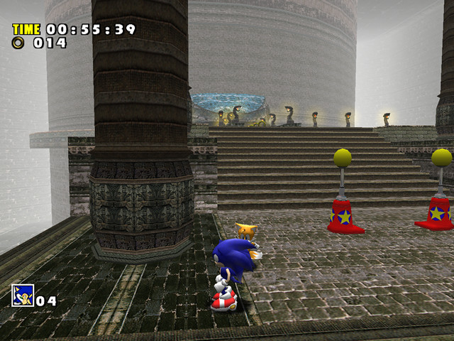
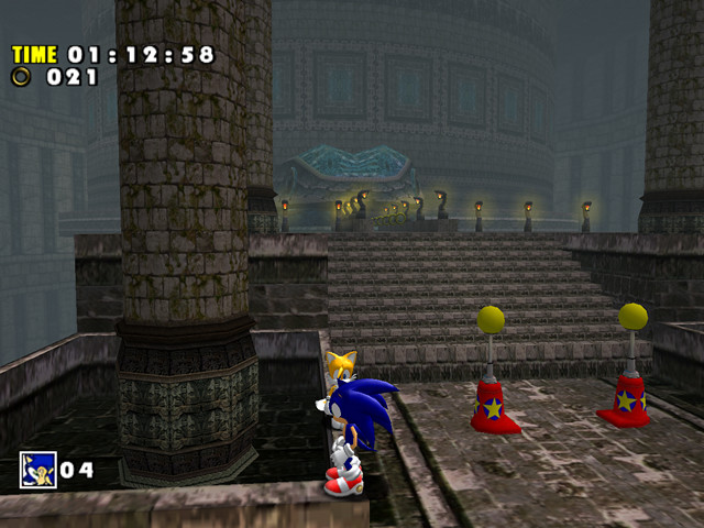
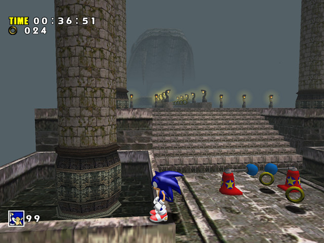
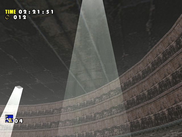
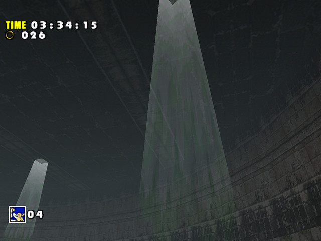
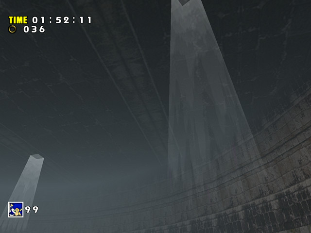
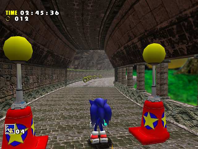
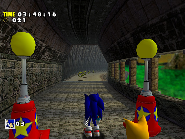
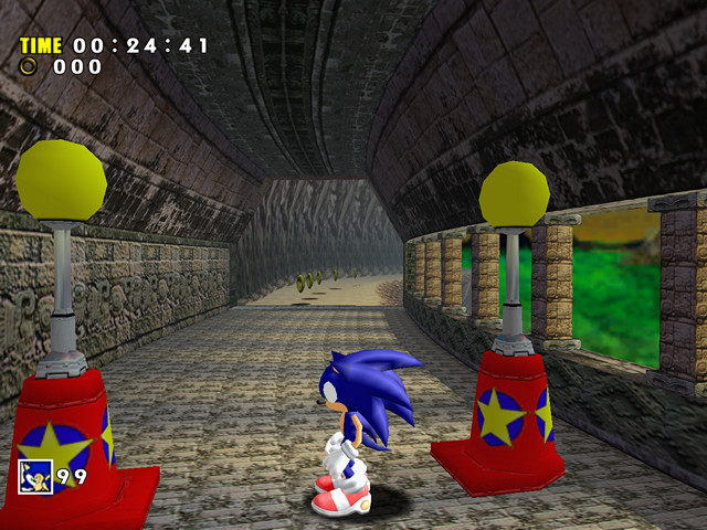
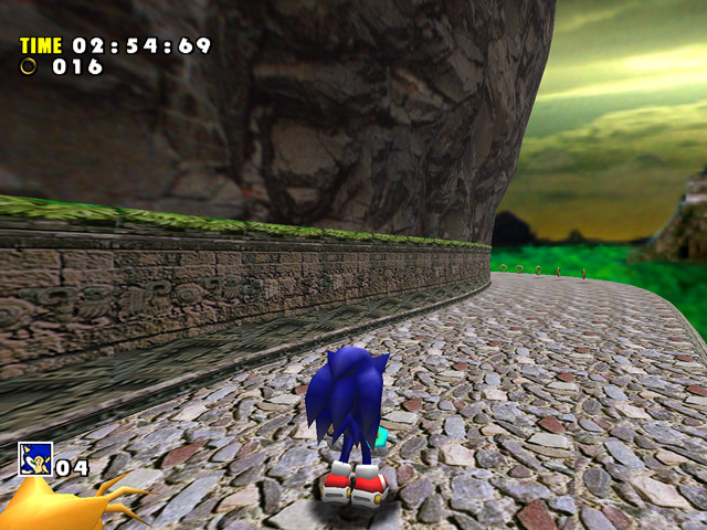
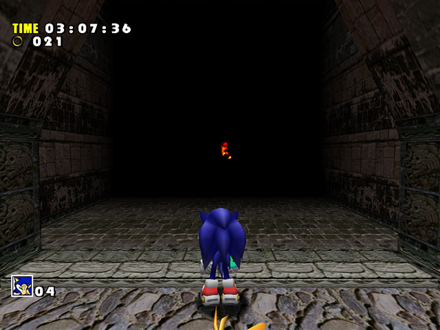
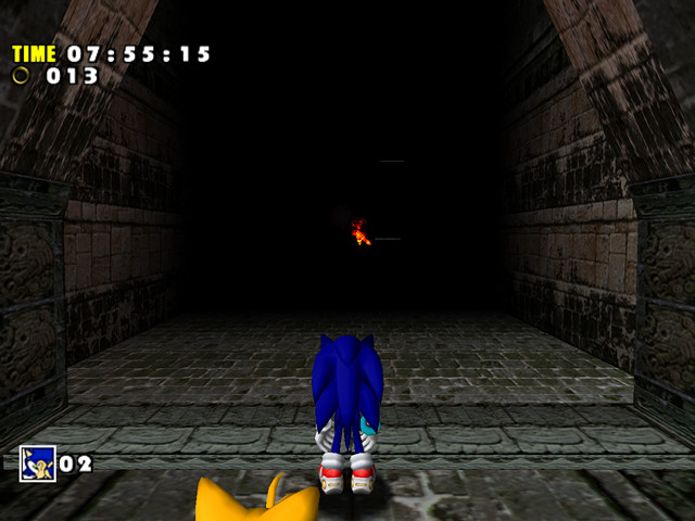
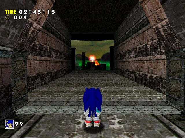
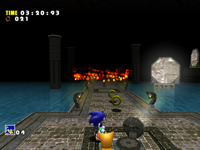
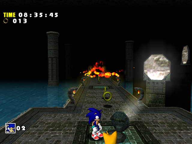
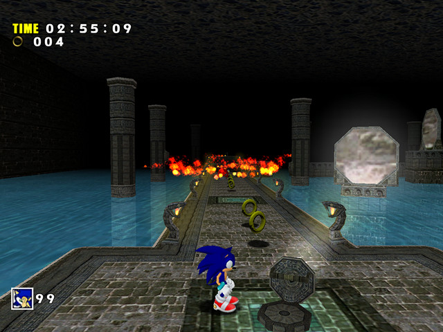
The start location reveals a somewhat different mood for the stage. Distant areas were shrouded in white fog on the Dreamcast, while the Gamecube version uses dark grey. In general, the level appears darker and more “withered”. If we forget for a moment that the original game was all about being a colorful spectacle at any given time, this change is not bad. It fits the “ruin” theme of the level quite well. The darker atmosphere also helps accentuate the lights* coming from those stone pillars:
* While not immediately noticeable, the majority of fire sprites in SADX are broken slightly because of changes to the particle system. More on that in the Miscellaneous section.
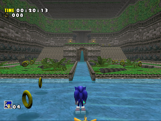
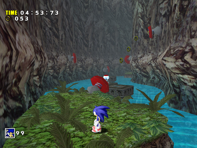
The area below has also received some redesign. The new model for plants looks more detailed than its rougher Dreamcast counterpart. The colors are duller, but for a ruin-themed level perhaps this is what the designers were going for:
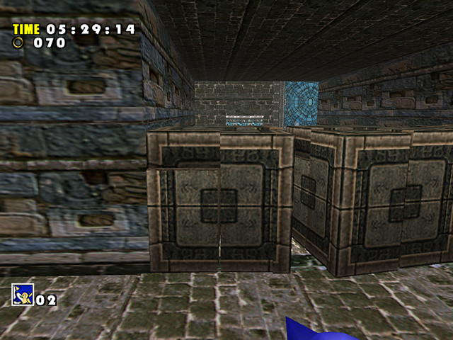
Some redesigns appear a bit strange, though. This area was flat on the Dreamcast, but now it has blocks with empty spaces. These blocks were likely supposed to be filled with water (SADX “Preview” prototype has water here), but it was removed for reasons unknown, leaving them empty:
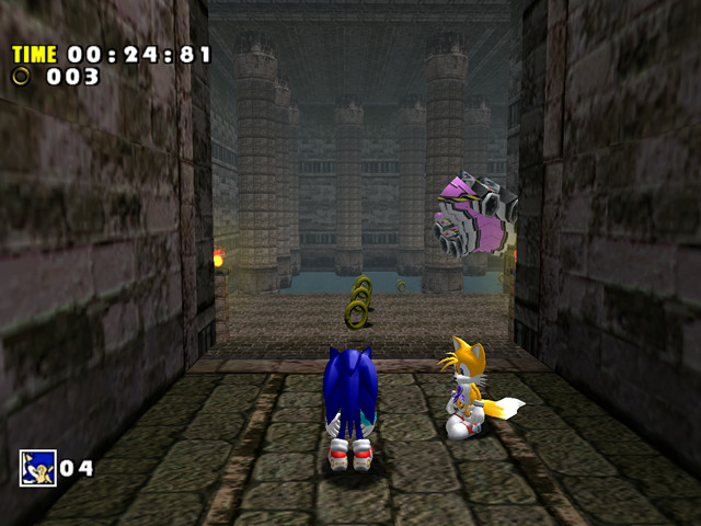
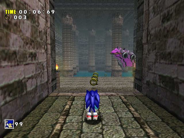
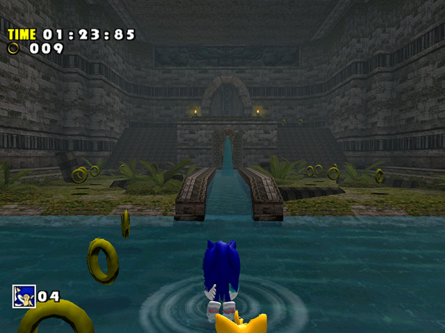
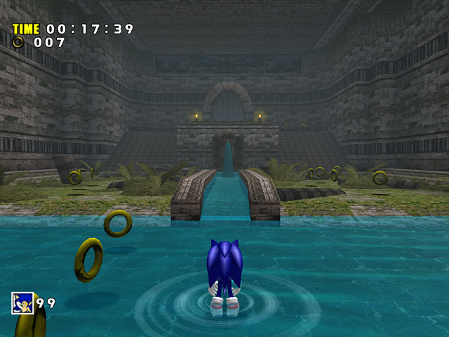
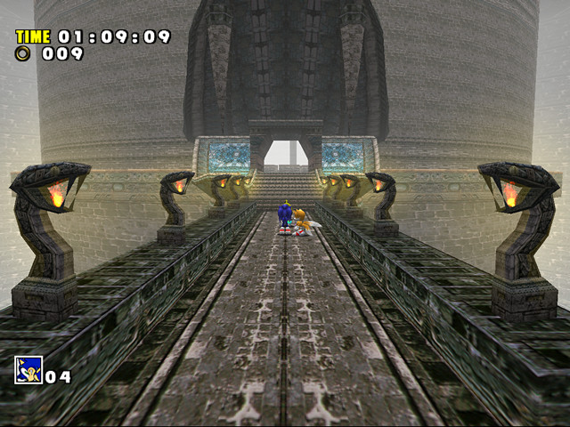
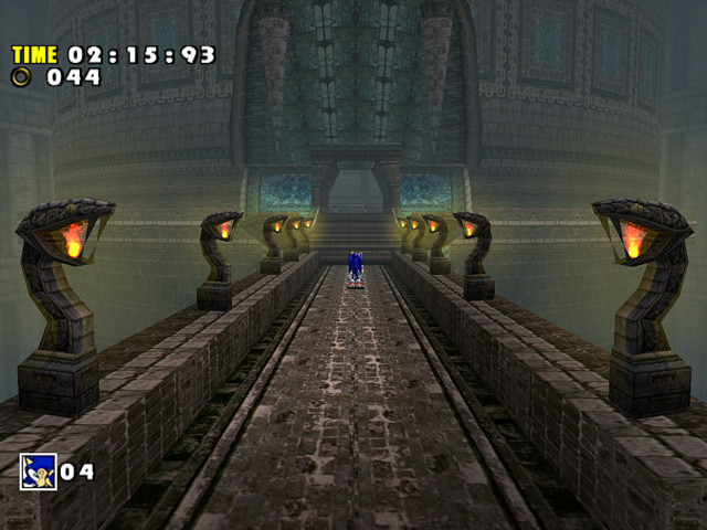
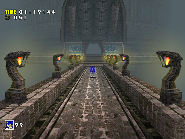
The snake room entrance is presented more effectively on the Gamecube. The darker theme works well with the lights. The fog is perhaps too thick in the PC version, but it still looks acceptable:
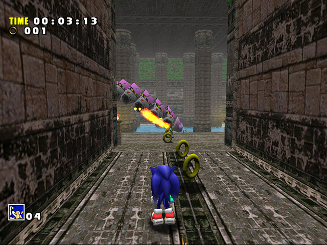
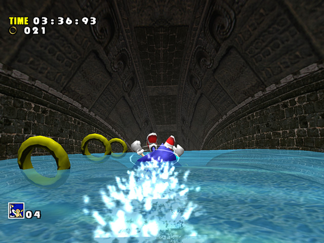
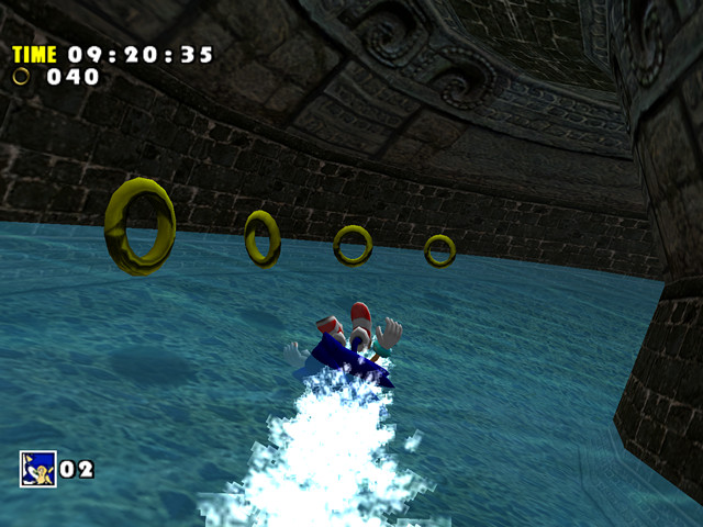
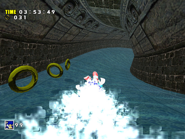
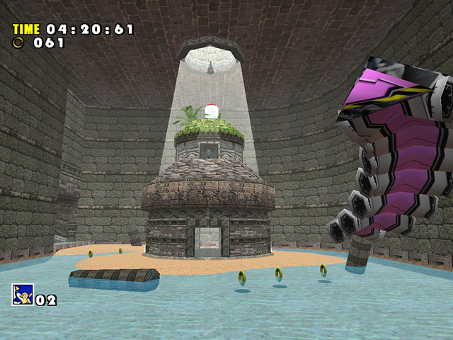
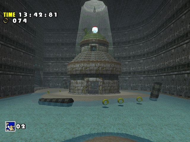
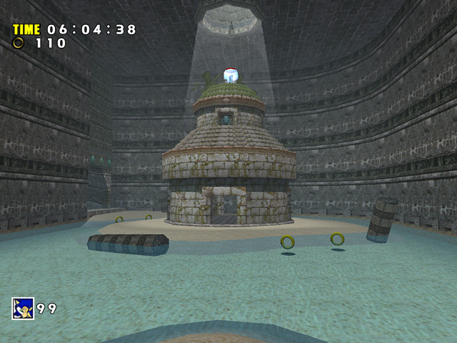
The problems begin after entering the snake room. The collision on the snake is glitchy in all versions of the game, however only in SADX the snake parts have a jittery position readjustment happening every few frames, which is noticeable enough to get annoying. The Gamecube’s distortion effect makes it difficult to navigate underwater, although some people might prefer that:
| Dreamcast | Gamecube |
|---|---|
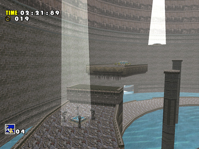
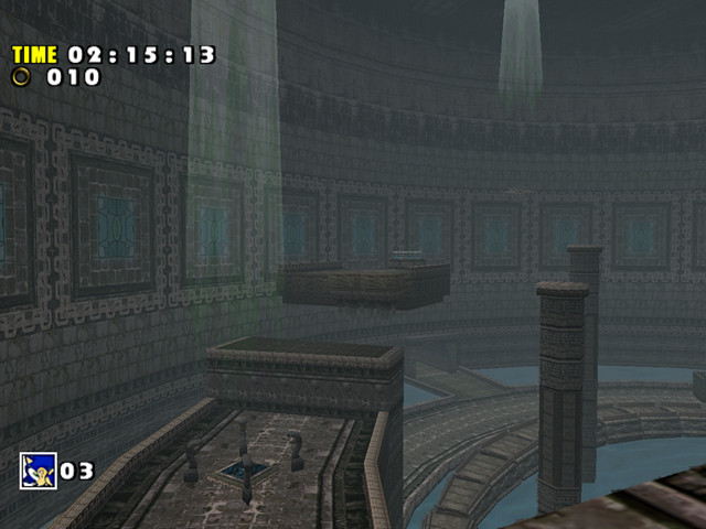
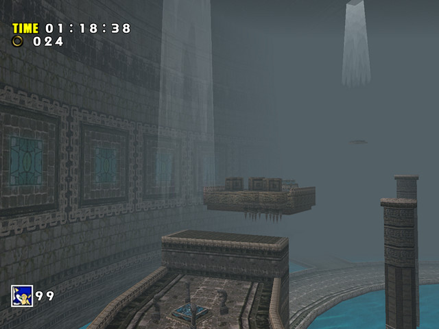
There are 3 buttons to press in the snake room, which open the door leading to the next area. In the Dreamcast version each of those buttons was illuminated by a light coming from the ceiling. The lights are still there in SADX, but they aren’t as bright and their texture has noticeable color banding:
An interesting detail about those lights is that their intensity depends on how far away you are from them – you can see that in the Dreamcast screenshot. When you get closer to the light, it becomes more transparent and less white. This effect is missing in both versions of SADX. In addition, the lights no longer reach far enough so they don’t go all the way to show the location of the button, which appears to have been their main purpose. Note a pretty nasty object draw distance limitation that makes the platform under the button disappear in the Dreamcast version, which was not fixed in the ports:
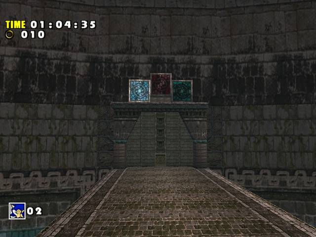
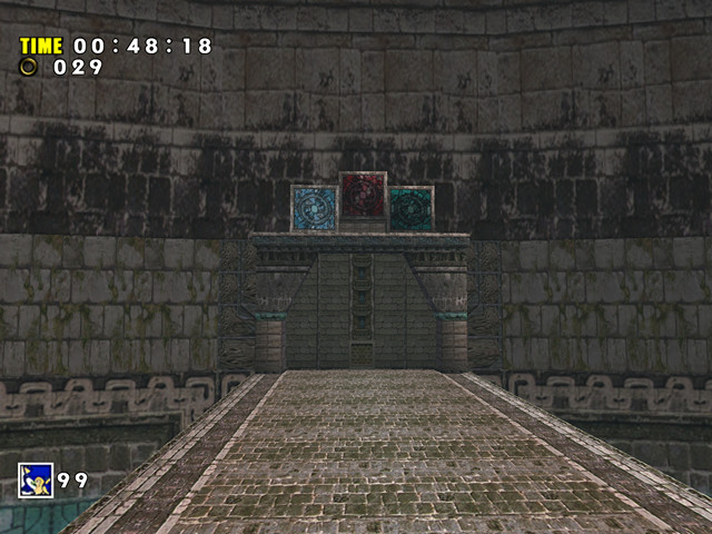
When you pressed one of those buttons, the game would show the door with three signs above it. The signs corresponded to the three buttons, and they would light up as you pressed them. It looked fine in the Dreamcast and Gamecube versions, but can you tell which button is pressed in the PC version?):
The starting area in Act 2 also received some redesign. The area around the first checkpoint is one of the few places in the entire game where the Gamecube’s lighting surpasses the original game:
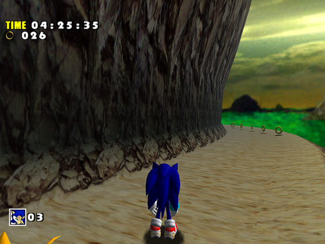
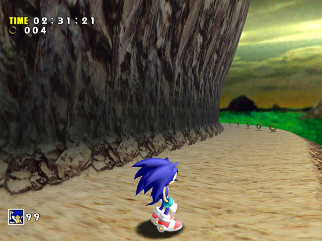
The areas before and after the checkpoint have also had redesigns. The stone floor was replaced with a sand texture that has visible seams on the right side, and the rocks on the wall are slightly more repetitive than the original texture:
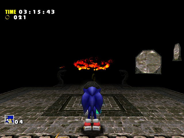
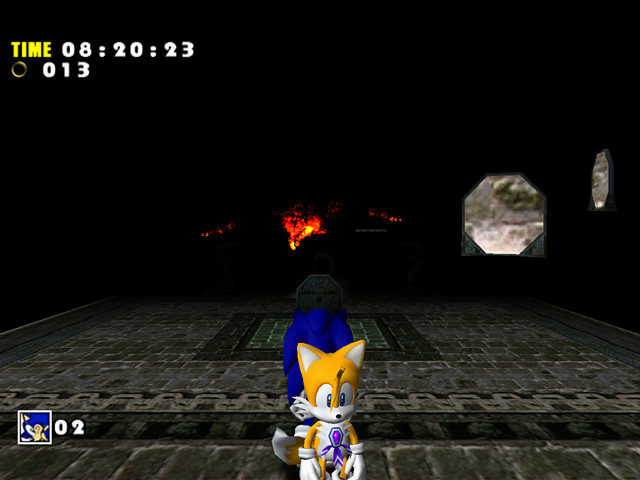
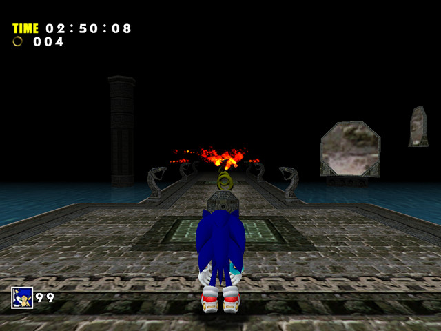
The mirror room is where things start breaking again. When it goes dark, the Gamecube version has some minor artifacts in the distance, while the PC version glitches out and displays the sky texture. This happens because of reduced draw distance in the ports. This doesn’t fix itself until you get far enough into the mirror room:
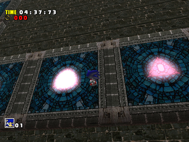
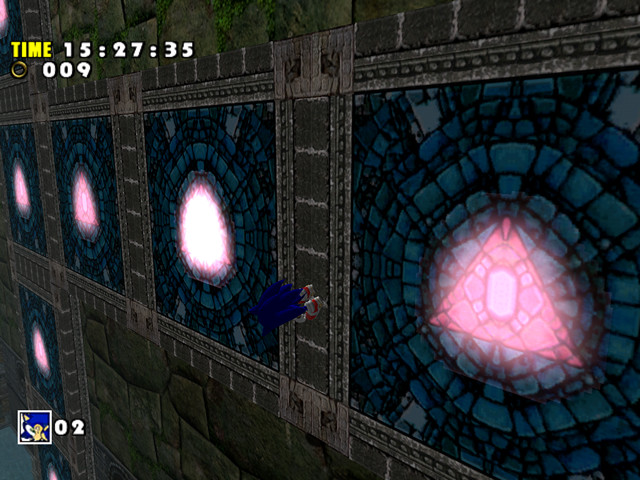
The mirror room has long been one of the biggest complaints among PC players because it never gets dark enough. It’s so well lit you could skip the whole room without activating a single mirror, but you can see even farther if you do activate one:
Particle effects such as water splashes have visible quality degradation in SADX because of alpha rejection and texture recompression. You can read more on alpha rejection in the Transparency section. Here’s what the water particles look like in SA1 and SADX:
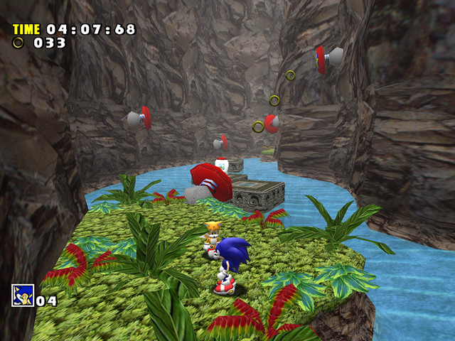
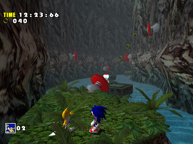
The rocks in this area have slightly better UVs in SADX. Also note how SADX made all plants the same color:
This area was re-textured, using the same textures in places where it was previously using unique textures.
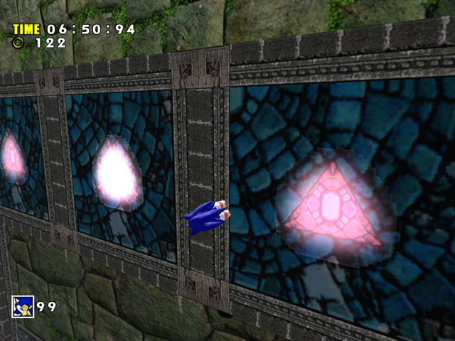
The panel glitch present in the original version (caused by a duplicate object entry in the SET file) was not fixed in the ports. Note how the transparent part of the panel’s texture got progressively worse with each port, and how the PC version’s texture lacks proper mirroring:
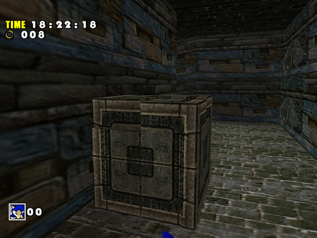
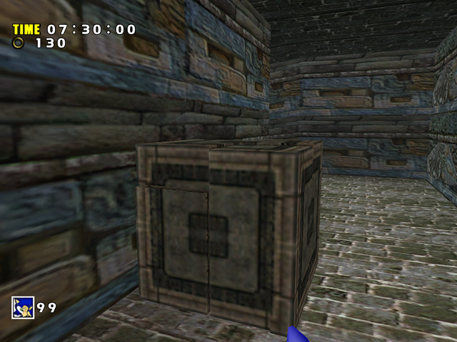
The PC version demonstrates massive texture quality reduction. You can see the box looks about the same in the Dreamcast and Gamecube versions, but loses a lot of detail in the PC version:
In conclusion, it is safe to say this level didn’t suffer as many issues in the Dreamcast-Gamecube transition as some other levels. Some issues seen in this level are general issues with SADX rather than level-specific problems. As Lost World didn’t have complex lighting or special effects, there wasn’t much the developers could break in it (but when there was, they did – like the mirror room in the PC version or ceiling lights in Act 1). You can play the original Dreamcast version of this level (which fixes issues with the mirror room, particles etc.) on PC with the Dreamcast Conversion mod. Find out more in the section on fixing the PC version of SADX.
